Introduction
Buoyant makes it easy to create flexible, dynamic, and (eventually) interactive UIs
on embedded systems. It is designed to be used with the embedded-graphics crate, but
can be adapted to other rendering targets.
The features and API language are heavily influenced by SwiftUI. If you’re already familiar with SwiftUI, you should feel right at home with Buoyant. If you aren’t, don’t worry.
Why create this?
The vast majority of my frontend experience is with SwiftUI, and I just want to use it for embedded. Despite what Apple would like you to think, Swift isn’t all that great for embedded, so here we are doing it in Rust.
The well known std Rust UI crates rely heavily on dynamic allocation, making them unsuitable
for porting to embedded.
On the embedded side, at least as of the time of writing, there weren’t any other solutions
I found very satisfying. I’m not really interested in buying into the Slint ecosystem,
and aside from that, you’d essentially be stuck manually placing elements with
embedded-graphics. Not fun at all.
This is my attempt to fill that need, and at least so far, it’s been far more successful than I imagined. While Buoyant is still very young and I still feel new to Rust, Buoyant is already capable of building fairly complex UIs in SwiftUI’s declarative style. Animations are not only possible, but quite easy to add.
Quickstart
Embedded graphics simulator
To run examples, you’ll need to follow the instructions in the embedded-graphics-simulator README to install sdl2.
Add dependencies
# Cargo.toml

[dependencies]
buoyant = "0.7"
embedded-graphics = "0.8"
embedded-graphics-simulator = "0.8"
Hello World
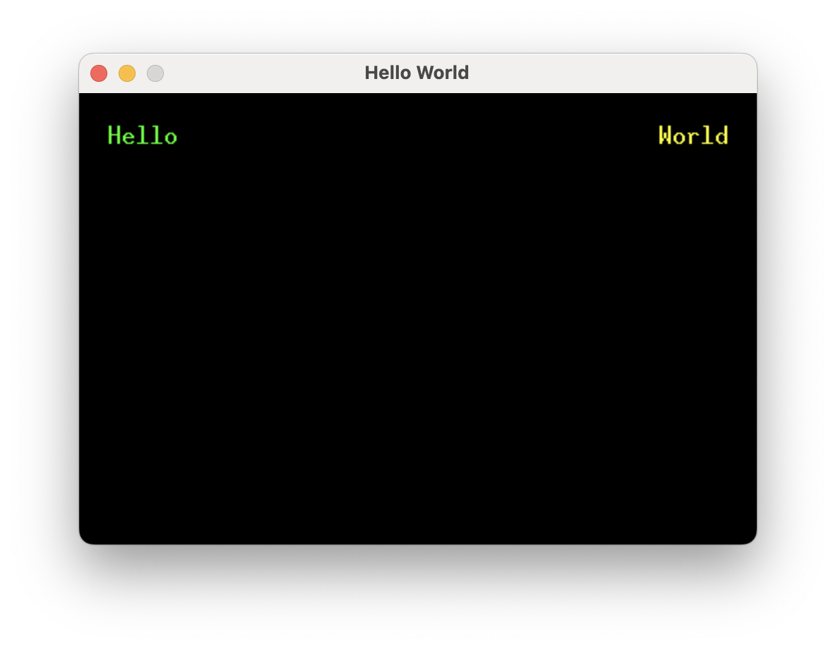
Running this example will result in the words “Hello” (green) and “World” (yellow) separated by as much space as possible, with 20 pixels of padding around the edges.
extern crate buoyant;
extern crate embedded_graphics;
extern crate embedded_graphics_simulator;

use buoyant::{
    environment::DefaultEnvironment,
    render_target::{EmbeddedGraphicsRenderTarget, RenderTarget as _},
    view::prelude::*,
};
use embedded_graphics::{mono_font::ascii::FONT_10X20, pixelcolor::Rgb888, prelude::*};
use embedded_graphics_simulator::{OutputSettings, SimulatorDisplay, Window};

const BACKGROUND_COLOR: Rgb888 = Rgb888::BLACK;
const DEFAULT_COLOR: Rgb888 = Rgb888::WHITE;

fn main() {
    let mut window = Window::new("Hello World", &OutputSettings::default());
    let mut display: SimulatorDisplay<Rgb888> = SimulatorDisplay::new(Size::new(480, 320));
    display.clear(BACKGROUND_COLOR);

    hello_view()
        .as_drawable(display.size(), DEFAULT_COLOR, &mut ())
        .draw(&mut display)
        .unwrap();

    window.show_static(&display);
}

fn hello_view() -> impl View<Rgb888, ()> {
    HStack::new((
        Text::new("Hello", &FONT_10X20).foreground_color(Rgb888::GREEN),
        Spacer::default(),
        Text::new("World", &FONT_10X20).foreground_color(Rgb888::YELLOW),
    ))
    .padding(Edges::All, 20)
}
This is more or less the bare minimum to get a window up and running with the simulator.
A window and a display framebuffer are created. display conforms to
embedded_graphics::DrawTarget<Color = Rgb888> and is what you’ll render content into.
The framebuffer is cleared to the background color, the view is rendered, and finally the framebuffer is displayed.
AsDrawable::as_drawableis doing all the heavy lifting here. It takes care of laying out the view within the provided size and then rendering it to the draw target.
View Body
#![allow(unused)]
fn main() {
extern crate buoyant;
extern crate embedded_graphics;

use buoyant::view::prelude::*;
use embedded_graphics::{mono_font::ascii::FONT_10X20, pixelcolor::Rgb888, prelude::*};

fn hello_view() -> impl View<Rgb888, ()> {
    HStack::new((
        Text::new("Hello", &FONT_10X20).foreground_color(Rgb888::GREEN),
        Spacer::default(),
        Text::new("World", &FONT_10X20).foreground_color(Rgb888::YELLOW),
    ))
    .padding(Edges::All, 20)
}
}
The view body returned from this function simply encodes the structure and relationships between elements, along with holding references to resources like text and fonts. Note it has no notion of size or position.
This is an example of a component view. Unlike SwiftUI where views are types, Buoyant components
are functions (sometimes on types). You can take this view and compose it with other views
the same way built-in components like Text are used.
Because embedded-graphics displays come in a wide variety of color spaces, component views
must also specify a color space. Often it’s useful to alias this to make migration to another
screen easy, with e.g. type COLOR = Rgb888.
While the
AsDrawabletrait is useful for quickly rendering a single view, theApptype provides more complete application lifecycle management and event handling.
Building Views
This section is an introduction to building views with Buoyant. It covers the process of using Buoyant, and is not intended to be an exhaustive reference of available features. For that, refer to the Buoyant documentation on docs.rs.
Prerequisites
For all the examples in this section, it is assumed that you have installed the
embedded-graphics-simulator
requirements and have added the following dependencies to your Cargo.toml:
[dependencies]
buoyant = "0.7"
embedded-graphics = "0.8"
embedded-graphics-simulator = "0.8.0"
The boilerplate from the quickstart is used to drive all the examples in this section. I’ve hidden it to keep the examples concise, but know you can still see it by clicking the eye icon in case you want to run the example locally.
Stacks
Adjacent layout
HStack and VStack are the primary tools you’ll use to arrange views side-by-side in Buoyant.
Both stacks can contain a heterogeneous set of views and can be nested inside other stacks.
extern crate buoyant;
extern crate embedded_graphics;
extern crate embedded_graphics_simulator;
use embedded_graphics::{pixelcolor::Rgb888, prelude::*};
use embedded_graphics_simulator::{OutputSettings, SimulatorDisplay, Window};
const BACKGROUND_COLOR: Rgb888 = Rgb888::CSS_DARK_SLATE_GRAY;
const DEFAULT_COLOR: Rgb888 = Rgb888::WHITE;
fn main() {
let mut window = Window::new("Example", &OutputSettings::default());
let mut display: SimulatorDisplay<Rgb888> = SimulatorDisplay::new(Size::new(480, 320));
display.clear(BACKGROUND_COLOR).unwrap();
view()
.as_drawable(display.size(), DEFAULT_COLOR, &mut ())
.draw(&mut display)
.unwrap();
window.show_static(&display);
}
use buoyant::view::prelude::*;
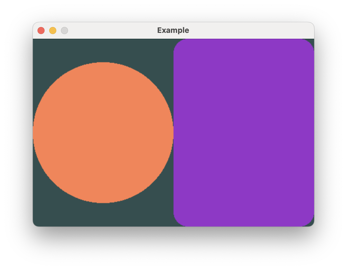
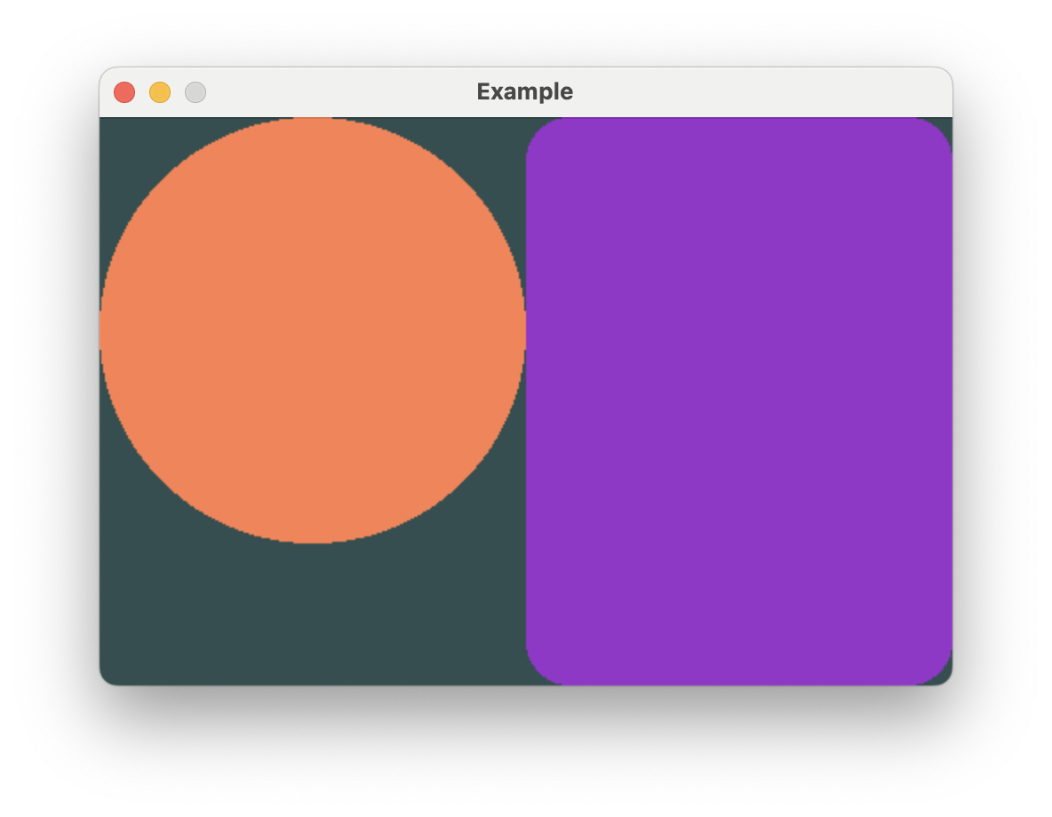
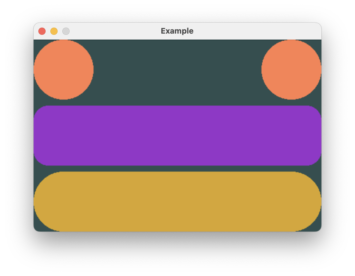
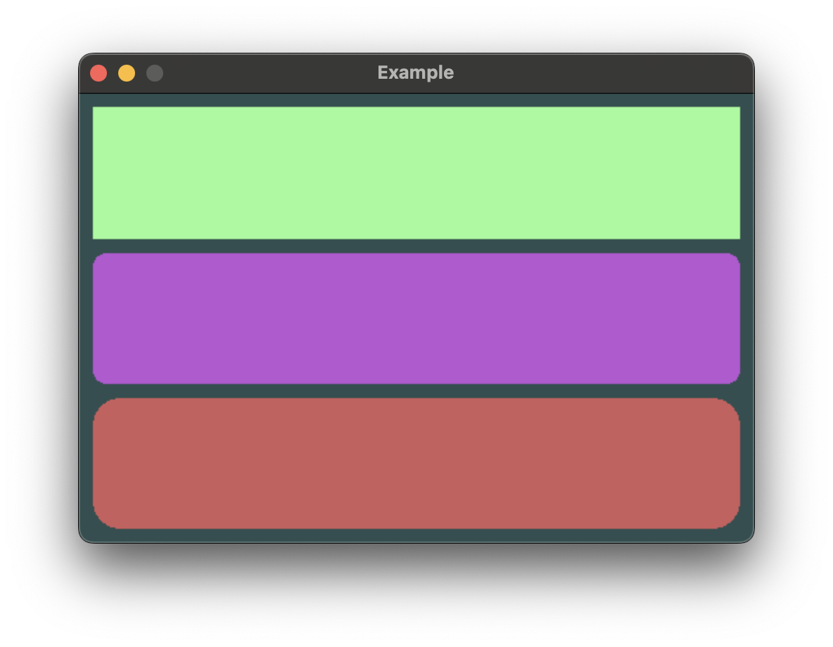
fn view() -> impl View<Rgb888, ()> {
HStack::new((
Circle
.stroked(15)
.foreground_color(Rgb888::CSS_CORAL),
Rectangle
.corner_radius(25)
.foreground_color(Rgb888::CSS_DARK_ORCHID),
))
}In this example, you can see HStack fairly offers both views half the available width.
Rectangle greedily takes all the offered space on both axes, while Circle only takes
space greedily on the shorter axis to retain its square aspect ratio.
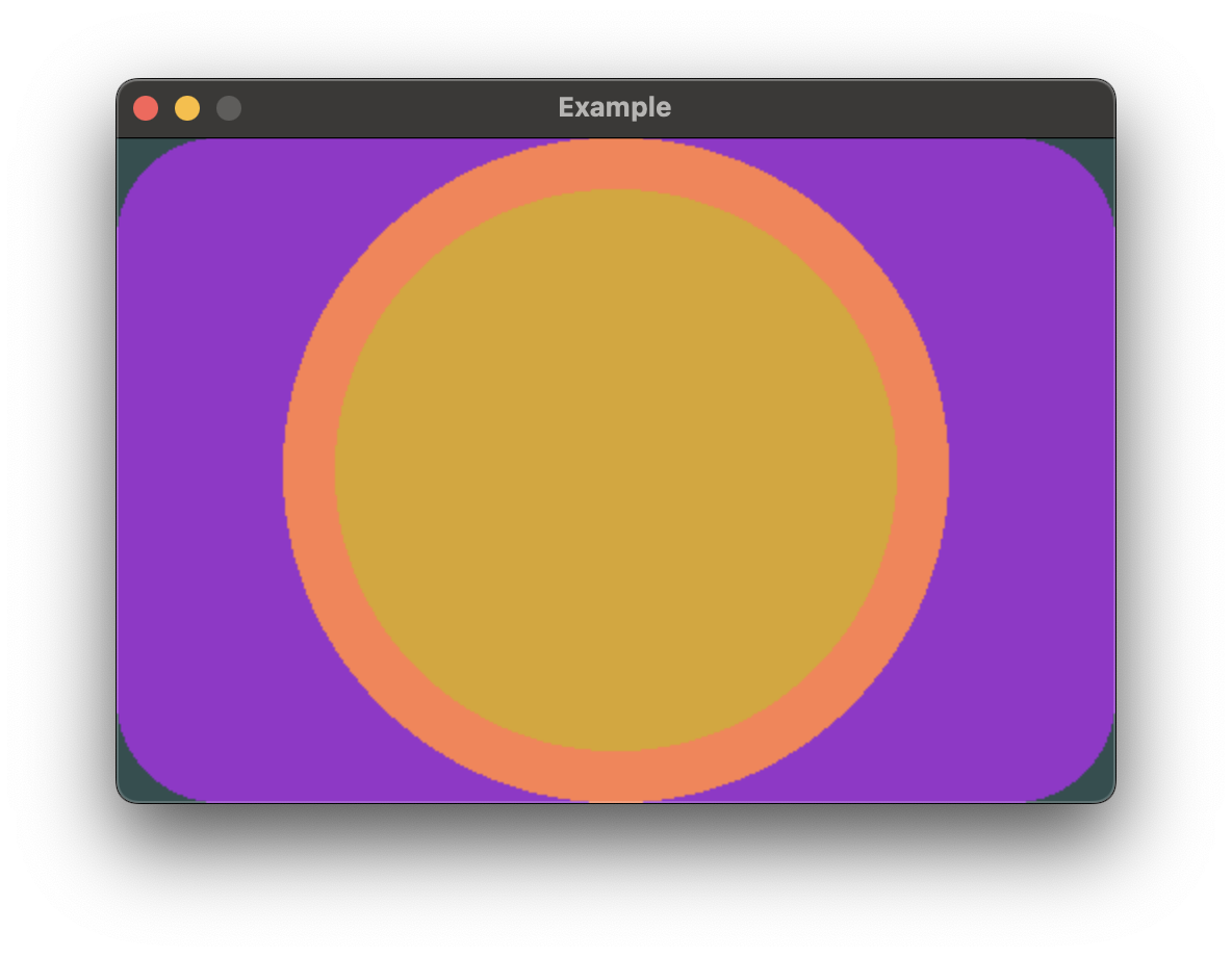
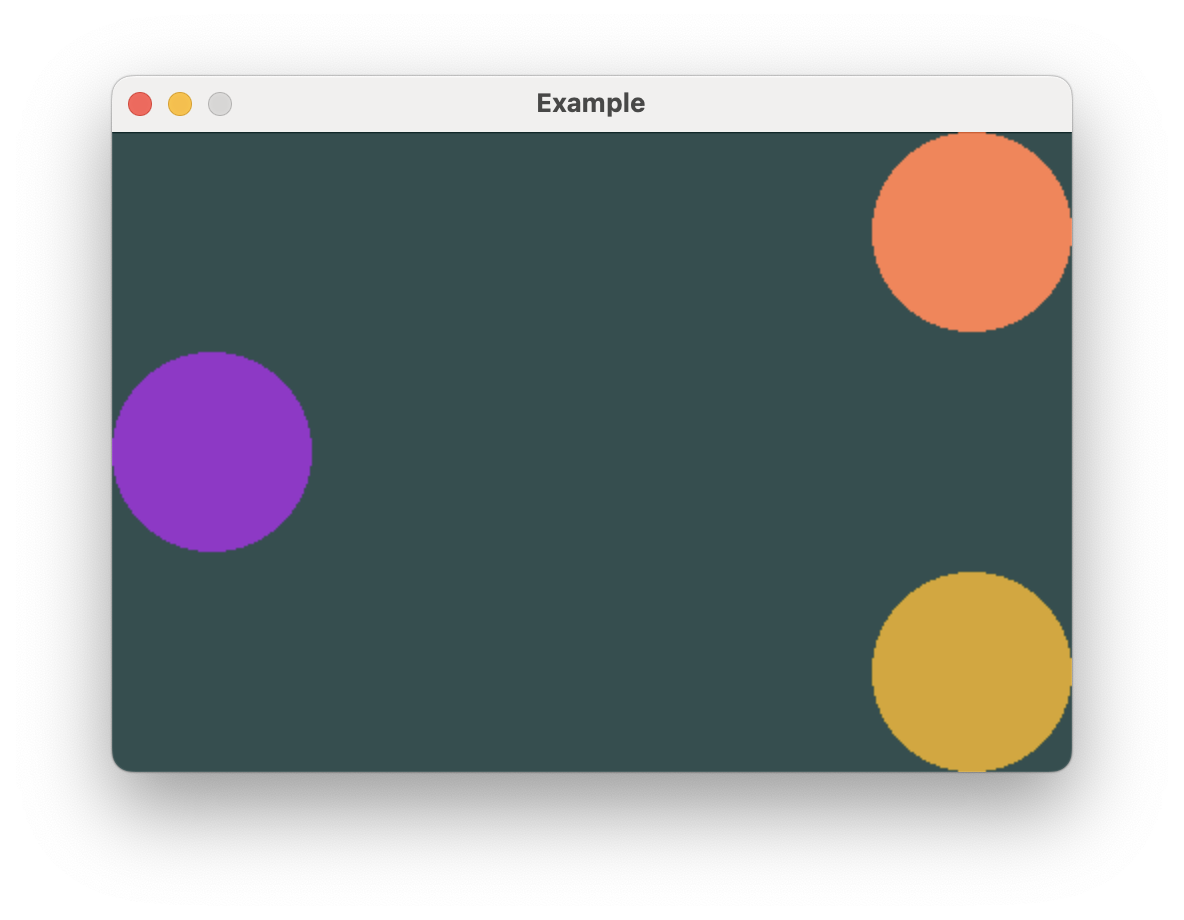
Arranging views on top of each other
ZStack can be used to overlay views on top of each other. Like HStack and VStack,
it can contain a heterogeneous set of views.
extern crate buoyant;
extern crate embedded_graphics;
extern crate embedded_graphics_simulator;
use embedded_graphics::{pixelcolor::Rgb888, prelude::*};
use embedded_graphics_simulator::{OutputSettings, SimulatorDisplay, Window};
const BACKGROUND_COLOR: Rgb888 = Rgb888::CSS_DARK_SLATE_GRAY;
const DEFAULT_COLOR: Rgb888 = Rgb888::WHITE;
fn main() {
let mut window = Window::new("Example", &OutputSettings::default());
let mut display: SimulatorDisplay<Rgb888> = SimulatorDisplay::new(Size::new(480, 320));
display.clear(BACKGROUND_COLOR).unwrap();
view()
.as_drawable(display.size(), DEFAULT_COLOR, &mut ())
.draw(&mut display)
.unwrap();
window.show_static(&display);
}
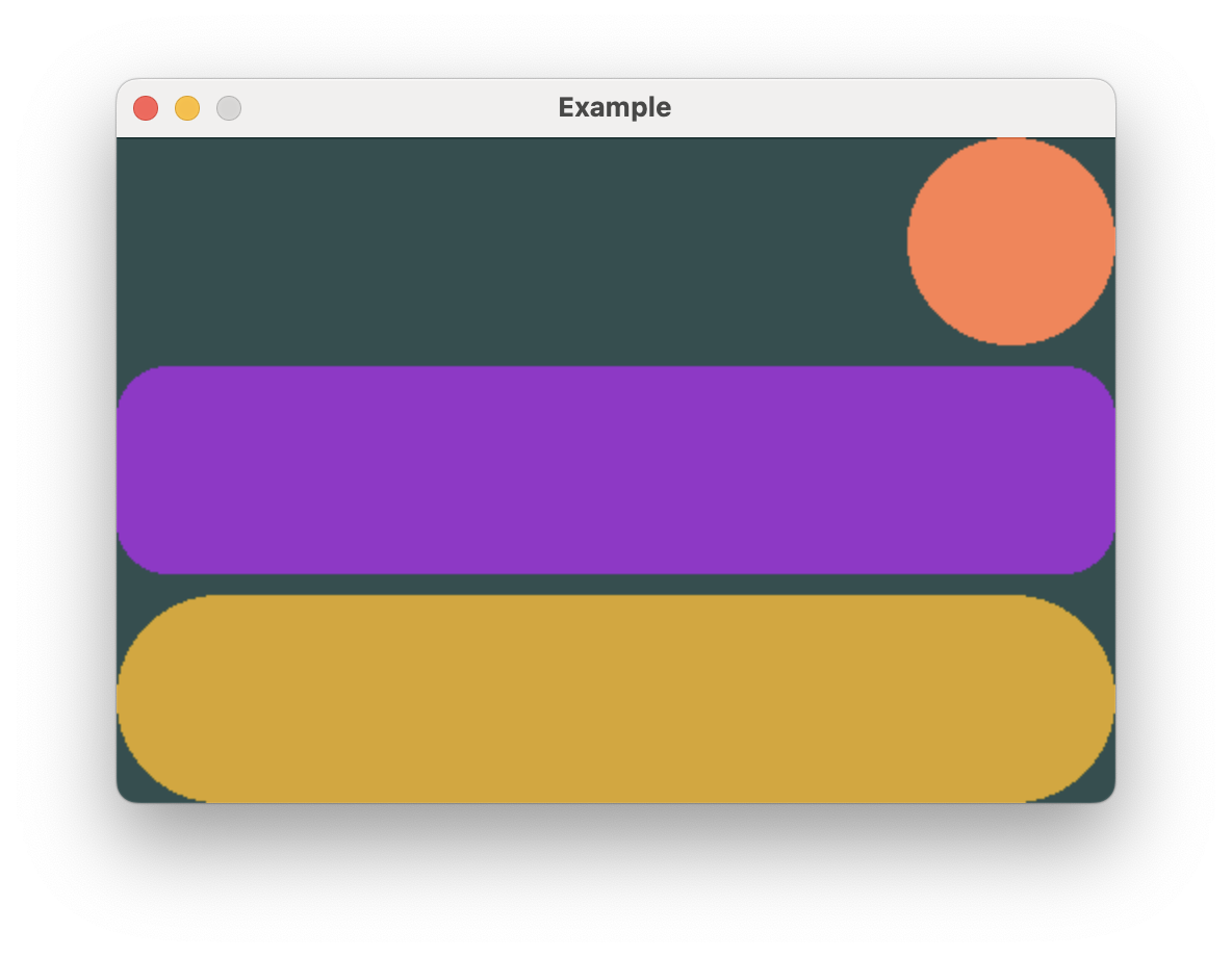
use buoyant::view::prelude::*;
fn view() -> impl View<Rgb888, ()> {
ZStack::new((
Rectangle
.corner_radius(50)
.foreground_color(Rgb888::CSS_DARK_ORCHID),
Circle.foreground_color(Rgb888::CSS_CORAL),
Circle
.foreground_color(Rgb888::CSS_GOLDENROD)
.padding(Edges::All, 25),
))
}The .padding() modifier is useful here to create space around the topmost yellow circle.
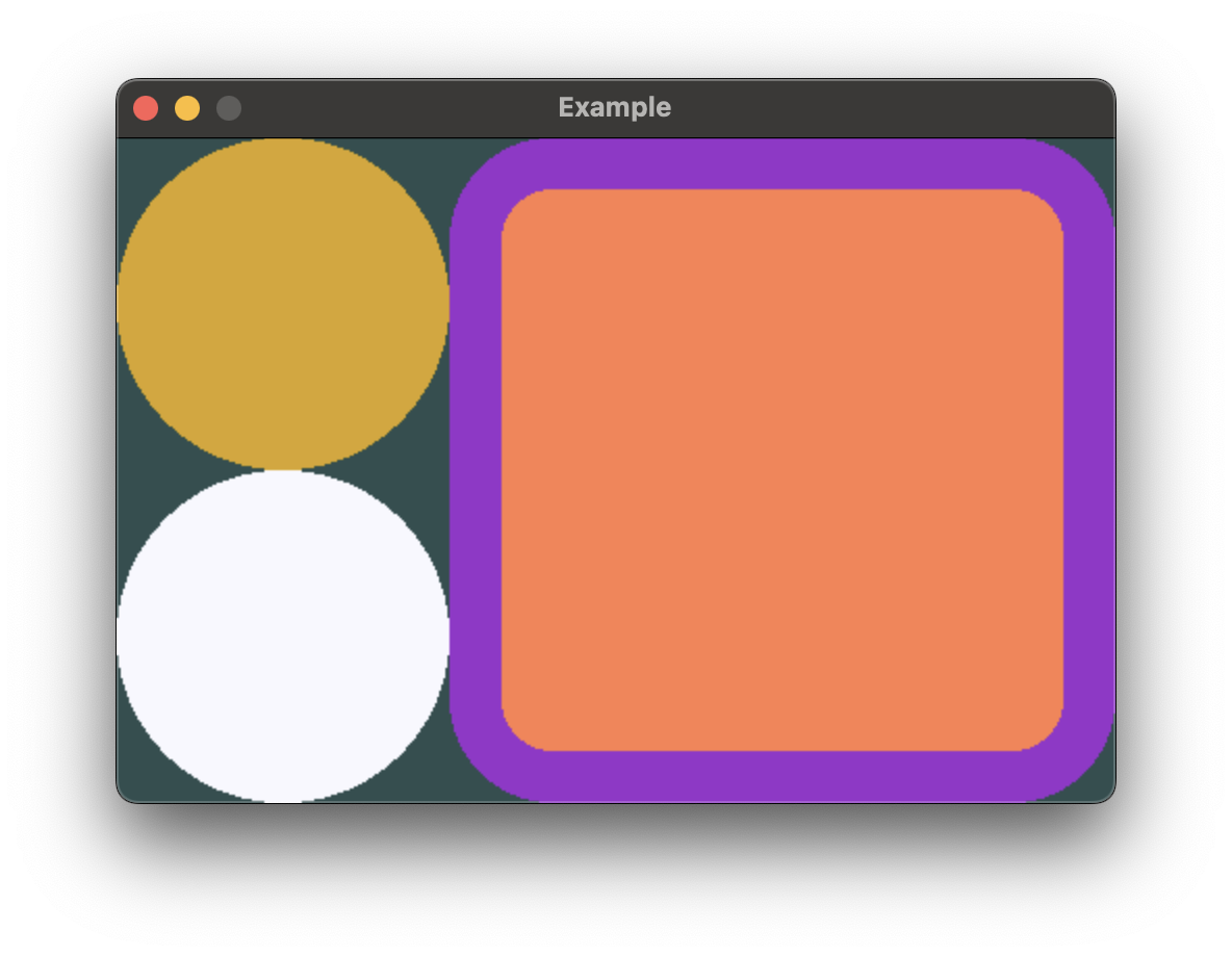
Combining Stacks
Stacks can be nested to create complex layouts.
extern crate buoyant;
extern crate embedded_graphics;
extern crate embedded_graphics_simulator;
use embedded_graphics::{pixelcolor::Rgb888, prelude::*};
use embedded_graphics_simulator::{OutputSettings, SimulatorDisplay, Window};

const BACKGROUND_COLOR: Rgb888 = Rgb888::CSS_DARK_SLATE_GRAY;
const DEFAULT_COLOR: Rgb888 = Rgb888::WHITE;

fn main() {
    let mut window = Window::new("Example", &OutputSettings::default());
    let mut display: SimulatorDisplay<Rgb888> = SimulatorDisplay::new(Size::new(480, 320));

    display.clear(BACKGROUND_COLOR).unwrap();

    view()
        .as_drawable(display.size(), DEFAULT_COLOR, &mut ())
        .draw(&mut display)
        .unwrap();

    window.show_static(&display);
}

use buoyant::view::prelude::*;

fn view() -> impl View<Rgb888, ()> {
    HStack::new((
        VStack::new((
            Circle.foreground_color(Rgb888::CSS_GOLDENROD),
            Circle.foreground_color(Rgb888::CSS_GHOST_WHITE),
        )),
        ZStack::new((
            Rectangle
                .corner_radius(50)
                .foreground_color(Rgb888::CSS_DARK_ORCHID),
            Rectangle
                .corner_radius(25)
                .foreground_color(Rgb888::CSS_CORAL)
                .padding(Edges::All, 25),
        )),
    ))
}
Stack conformance to the necessary traits is macro-derived up to stacks of 10 views
Alignment
When arranging elements in stacks, placement ambiguity can arise when the child views differ in length along the axis opposite to the arrangement axis.
Vertical stacks can have horizontal alignment ambiguity, and horizontal stacks can have vertical alignment ambiguity.
In the previous example, the HStack height resolved to the full window height
because Rectangle takes height greedily. But the Circle frame is shorter
so Buoyant needs to make a decision about where to place it. This ambiguity was
resolved using the default, Center, but you can change it by calling
.with_alignment() on the stack.
If you wanted to align the Circle from the previous example to the top edge,
you could set VerticalAlignment::Top.
extern crate buoyant;
extern crate embedded_graphics;
extern crate embedded_graphics_simulator;
use embedded_graphics::{pixelcolor::Rgb888, prelude::*};
use embedded_graphics_simulator::{OutputSettings, SimulatorDisplay, Window};

const BACKGROUND_COLOR: Rgb888 = Rgb888::CSS_DARK_SLATE_GRAY;
const DEFAULT_COLOR: Rgb888 = Rgb888::WHITE;

fn main() {
    let mut window = Window::new("Example", &OutputSettings::default());
    let mut display: SimulatorDisplay<Rgb888> = SimulatorDisplay::new(Size::new(480, 320));

    display.clear(BACKGROUND_COLOR).unwrap();

    view()
        .as_drawable(display.size(), DEFAULT_COLOR, &mut ())
        .draw(&mut display)
        .unwrap();

    window.show_static(&display);
}

use buoyant::view::prelude::*;

fn view() -> impl View<Rgb888, ()> {
    HStack::new((
        Circle.foreground_color(Rgb888::CSS_CORAL),
        Rectangle
            .corner_radius(25)
            .foreground_color(Rgb888::CSS_DARK_ORCHID),
    ))
    .with_alignment(VerticalAlignment::Top)
}
You’ll see this ambiguity arise again with ZStack and the frame modifiers.
A note on how SwiftUI alignment differs
If you’re coming from SwiftUI, your understanding of alignment is most likely a bit wrong. This is probably fine, and conveniently, if you’re wrong about SwiftUI you probably already have the correct understanding of alignment in Buoyant!
I think it’s worth briefly explaining how SwiftUI alignment actually works and what that means for special alignments you can’t build (yet) in Buoyant. Feel free to skip this if you’re totally new to both and feeling lost.
Using HStack as an example, when you specify .bottom vertical alignment in SwiftUI you are
not telling the HStack to align all the children to the bottom edge of the stack. You are
telling it to align the .bottom alignment guides of all the children. Each child view
reports a set of named marks, called alignment guides, which the stack uses for alignment.
While generally you can assume .top is placed at y = 0 and .bottom is placed at y =
frame.height, views are free to place these guides wherever they want. The stack simply
lines up the mark across all the children. Custom marks are even preserved when nesting
views inside other modifiers.
This is especially useful when you have a horizontal stack containing text of multiple sizes. You can tell SwiftUI to align the text baselines, giving a much more visually appealing result.
Buoyant does not have this feature, but I recognize the utility it provides. For now, you can only align to the center and outer edges. Thinking about alignment in terms of “Top aligns views to the top” is correct for Buoyant.
Stack Spacing
Stack spacing is the first spacing you should reach for. It applies fixed spacing between child views.
By default, VStack and HStack place their child views with no spacing in between.
You can configure the spacing between child views using .with_spacing.
extern crate buoyant;
extern crate embedded_graphics;
extern crate embedded_graphics_simulator;
use embedded_graphics::{pixelcolor::Rgb888, prelude::*};
use embedded_graphics_simulator::{OutputSettings, SimulatorDisplay, Window};

const BACKGROUND_COLOR: Rgb888 = Rgb888::CSS_DARK_SLATE_GRAY;
const DEFAULT_COLOR: Rgb888 = Rgb888::WHITE;

fn main() {
    let mut window = Window::new("Example", &OutputSettings::default());
    let mut display: SimulatorDisplay<Rgb888> = SimulatorDisplay::new(Size::new(480, 320));

    display.clear(BACKGROUND_COLOR).unwrap();

    view()
        .as_drawable(display.size(), DEFAULT_COLOR, &mut ())
        .draw(&mut display)
        .unwrap();

    window.show_static(&display);
}

use buoyant::view::prelude::*;

fn view() -> impl View<Rgb888, ()> {
    VStack::new((
        Circle.foreground_color(Rgb888::CSS_CORAL),
        Rectangle
            .corner_radius(25)
            .foreground_color(Rgb888::CSS_DARK_ORCHID),
        Capsule.foreground_color(Rgb888::CSS_GOLDENROD),
    ))
    .with_alignment(HorizontalAlignment::Trailing)
    .with_spacing(10)
}
Creating Visual Hierarchy
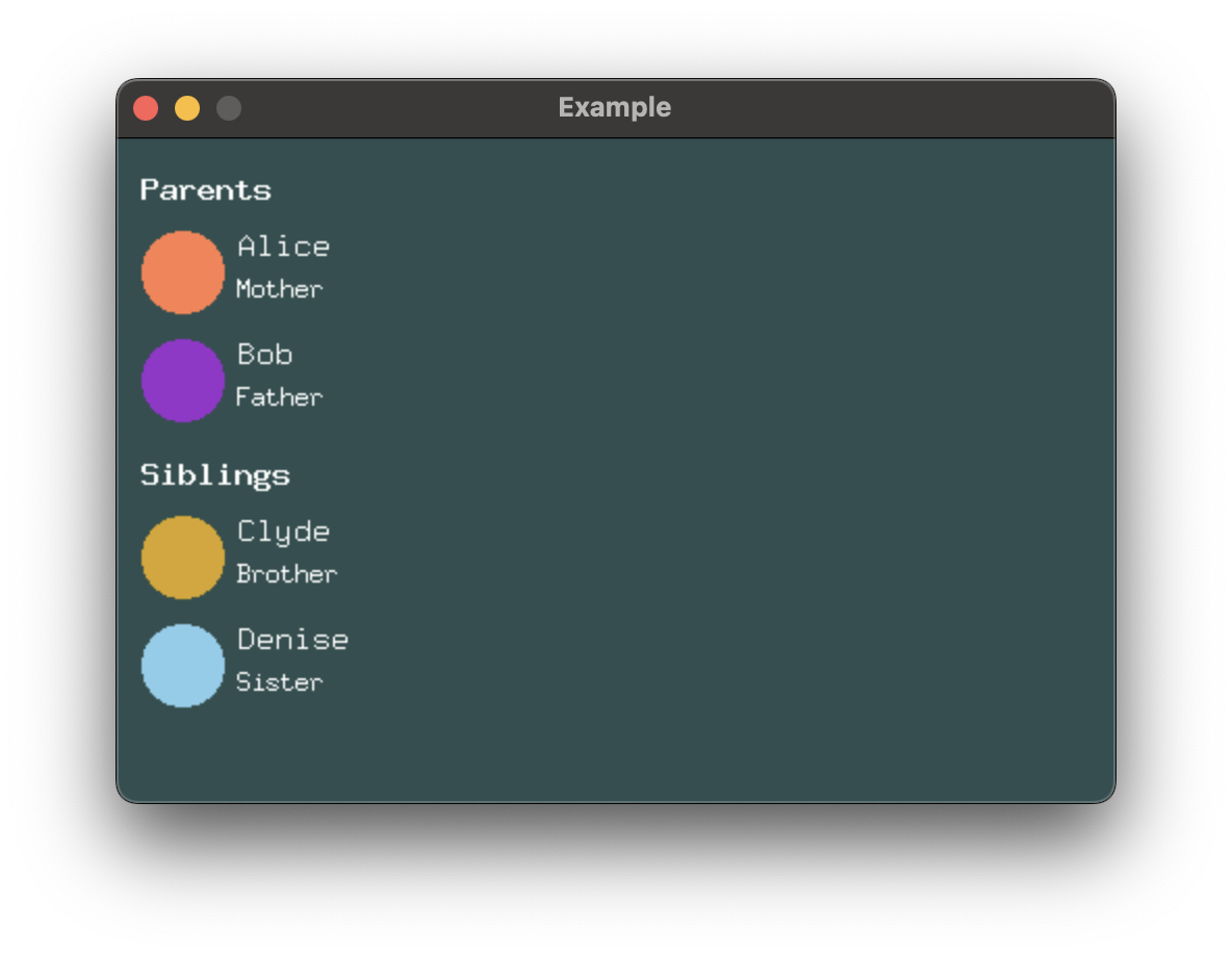
Often, you’ll want to create a hierarchy which visually separates primitive elements, components, and sections of components. You can achieve this by nesting stacks and using incrementally larger values for each class of separation.
extern crate buoyant;
extern crate embedded_graphics;
extern crate embedded_graphics_simulator;
use embedded_graphics_simulator::{OutputSettings, SimulatorDisplay, Window};

const BACKGROUND_COLOR: Rgb888 = Rgb888::CSS_DARK_SLATE_GRAY;
const DEFAULT_COLOR: Rgb888 = Rgb888::WHITE;

fn main() {
    let mut window = Window::new("Example", &OutputSettings::default());
    let mut display: SimulatorDisplay<Rgb888> = SimulatorDisplay::new(Size::new(480, 320));

    display.clear(BACKGROUND_COLOR).unwrap();

    view()
        .as_drawable(display.size(), DEFAULT_COLOR, &mut ())
        .draw(&mut display)
        .unwrap();

    window.show_static(&display);
}

use buoyant::view::prelude::*;
use embedded_graphics::{
    mono_font::ascii::{FONT_7X13, FONT_9X15, FONT_9X15_BOLD},
    pixelcolor::Rgb888,
    prelude::*,
};

mod spacing {
    pub const ELEMENT: u32 = 6;
    pub const COMPONENT: u32 = 12;
    pub const SECTION: u32 = 18;
}

fn view() -> impl View<Rgb888, ()> {
    VStack::new((
        VStack::new((
            Text::new("Parents", &FONT_9X15_BOLD),
            contact_row(Rgb888::CSS_CORAL, "Alice", "Mother"),
            contact_row(Rgb888::CSS_DARK_ORCHID, "Bob", "Father"),
        ))
        .with_alignment(HorizontalAlignment::Leading)
        .with_spacing(spacing::COMPONENT),
        VStack::new((
            Text::new("Siblings", &FONT_9X15_BOLD),
            contact_row(Rgb888::CSS_GOLDENROD, "Clyde", "Brother"),
            contact_row(Rgb888::CSS_SKY_BLUE, "Denise", "Sister"),
        ))
        .with_alignment(HorizontalAlignment::Leading)
        .with_spacing(spacing::COMPONENT),
    ))
    .with_alignment(HorizontalAlignment::Leading)
    .with_spacing(spacing::SECTION)
    .padding(Edges::Horizontal, spacing::COMPONENT)
    .padding(Edges::Vertical, spacing::SECTION)
}

fn contact_row<'a>(
    color: Rgb888,
    name: &'a str,
    relationship: &'a str,
) -> impl View<Rgb888, ()> + use<'a> {
    HStack::new((
        Circle.foreground_color(color).frame().with_width(40),
        VStack::new((
            Text::new(name, &FONT_9X15),
            Text::new(relationship, &FONT_7X13),
        ))
        .with_alignment(HorizontalAlignment::Leading)
        .with_spacing(spacing::ELEMENT)
        .foreground_color(Rgb888::WHITE),
    ))
    .with_alignment(VerticalAlignment::Top)
    .with_spacing(spacing::ELEMENT)
}
The frames of Buoyant built-in views are always tight to the rendered content1. You should strive to maintain this property in your custom component views. Without it, you’ll find it difficult to maintain well-organized hierarchies.
Watch out for alignment
Make sure you pay close attention to the alignment you set on each stack. Forgetting the
alignment on the components VStacks would give you this weird result. Note how the frame
of the outer VStack only actually extends to the end of the longest text.
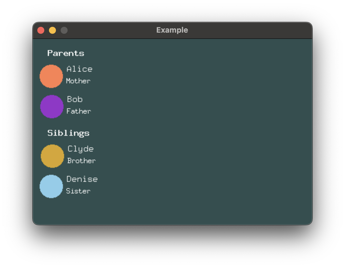
While it’s fairly obvious here that something is off, it can be much more subtle when you have text that spans the entire window width. Depending on where the text wraps, you may only sometimes see the problem.
-
Text rendered with
embedded-graphicsmonospace fonts break the “tight frames” rule. If you look closely, you’ll see that names which render entirely above the baseline (no g, j, p, q, or y) appear to have weird extra spacing underneath that doesn’t match the other nearby element spacing. This is what you’re trying to avoid by ensuring your frames are tight to the rendered content. ↩
Separating Views
Spacer is used as a sort of shim to create flexible spacing between views in a stack.
Here, Spacer is used to push the two Circles to either side.
extern crate buoyant;
extern crate embedded_graphics;
extern crate embedded_graphics_simulator;
use embedded_graphics::{pixelcolor::Rgb888, prelude::*};
use embedded_graphics_simulator::{OutputSettings, SimulatorDisplay, Window};

const BACKGROUND_COLOR: Rgb888 = Rgb888::CSS_DARK_SLATE_GRAY;
const DEFAULT_COLOR: Rgb888 = Rgb888::WHITE;

fn main() {
    let mut window = Window::new("Example", &OutputSettings::default());
    let mut display: SimulatorDisplay<Rgb888> = SimulatorDisplay::new(Size::new(480, 320));

    display.clear(BACKGROUND_COLOR).unwrap();

    view()
        .as_drawable(display.size(), DEFAULT_COLOR, &mut ())
        .draw(&mut display)
        .unwrap();

    window.show_static(&display);
}

use buoyant::view::prelude::*;

fn view() -> impl View<Rgb888, ()> {
    VStack::new((
        HStack::new((
            Circle.foreground_color(Rgb888::CSS_CORAL),
            Spacer::default(),
            Circle.foreground_color(Rgb888::CSS_CORAL),
        )),
        Rectangle
            .corner_radius(25)
            .foreground_color(Rgb888::CSS_DARK_ORCHID),
        Capsule.foreground_color(Rgb888::CSS_GOLDENROD),
    ))
    .with_alignment(HorizontalAlignment::Trailing) // no effect!
    .with_spacing(10)
}
Note that with this update, changes to the VStack alignment no longer have any effect!
The Spacer forces the HStack to always take the full width offered by the VStack,
meaning the VStack child views will always have the same width. There is therefore no
ambiguity in the alignment of the VStack children.
Mixed Alignment
Consider creating the following view with these requirements:
- The purple circle should be aligned to the left, while the orange and yellow circles should be aligned to the right.
- The layout should span the entire width of the window.
- The circles should all be roughly a third the height of the window, with a bit of spacing.
Using Spacer to achieve alignment
You’re probably thinking, “this feels like the perfect time to use Spacer!”
I’ll briefly indulge this misconception.
extern crate buoyant;
extern crate embedded_graphics;
extern crate embedded_graphics_simulator;
use embedded_graphics::{pixelcolor::Rgb888, prelude::*};
use embedded_graphics_simulator::{OutputSettings, SimulatorDisplay, Window};

const BACKGROUND_COLOR: Rgb888 = Rgb888::CSS_DARK_SLATE_GRAY;
const DEFAULT_COLOR: Rgb888 = Rgb888::WHITE;

fn main() {
    let mut window = Window::new("Example", &OutputSettings::default());
    let mut display: SimulatorDisplay<Rgb888> = SimulatorDisplay::new(Size::new(480, 320));

    display.clear(BACKGROUND_COLOR).unwrap();

    view()
        .as_drawable(display.size(), DEFAULT_COLOR, &mut ())
        .draw(&mut display)
        .unwrap();

    window.show_static(&display);
}

// No!
use buoyant::view::prelude::*;

fn view() -> impl View<Rgb888, ()> {
    VStack::new((
        Circle.foreground_color(Rgb888::CSS_CORAL),
        HStack::new((
            Circle.foreground_color(Rgb888::CSS_DARK_ORCHID),
            Spacer::default(),
        )),
        Circle.foreground_color(Rgb888::CSS_GOLDENROD),
    ))
    .with_alignment(HorizontalAlignment::Trailing)
    .with_spacing(10)
}
The VStack is set to align the trailing edges of its children simply because it’s more
convenient given there are more child views that need to be aligned to the right.
On their own, the Circles would not result in the VStack spanning the entire width,
so an extra HStack is added with a Spacer to make sure at least one child spans the
full width. It even serves a dual purpose of aligning the purple Circle to the left side!
This does produce the desired result, but there’s a better way to achieve it.
A note for SwiftUI developers
In SwiftUI, Spacers have a 10 point minimum length. While it’s probably not an issue for this specific example, using the HStack+Spacer solution in SwiftUI without manually overriding the Spacer minimum length results in 10 points of space your content can never fill. Text wraps a bit early and you can’t put your finger on why you feel a little sad.
This is such a common mistake in SwiftUI that Buoyant uses 0 as the default minimum Spacer
length. Now you can make this mistake and only I’ll be sad.
Flexible Frames
A better way to get the same result is to use the flex_frame() modifier, which is closely
related to the fixed .frame() modifier used earlier to set the width of the Circle
in the contact_row component.
Instead of setting fixed dimensions, flexible frames allow you to create a virtual frame with configurable minimum and maximum dimensions. Child views won’t necessarily take all the space within this frame, so you can also specify horizontal and vertical alignment to place the child within the virtual frame.
Buoyant provides .with_infinite_max_width() and .with_infinite_max_height() for creating
virtual frames that are as wide or tall as possible. You can use this in combination with
a leading horizontal alignment of the circle inside the frame to achieve the same result
as the previous code.
extern crate buoyant;
extern crate embedded_graphics;
extern crate embedded_graphics_simulator;
use embedded_graphics::{pixelcolor::Rgb888, prelude::*};
use embedded_graphics_simulator::{OutputSettings, SimulatorDisplay, Window};

const BACKGROUND_COLOR: Rgb888 = Rgb888::CSS_DARK_SLATE_GRAY;
const DEFAULT_COLOR: Rgb888 = Rgb888::WHITE;

fn main() {
    let mut window = Window::new("Example", &OutputSettings::default());
    let mut display: SimulatorDisplay<Rgb888> = SimulatorDisplay::new(Size::new(480, 320));

    display.clear(BACKGROUND_COLOR).unwrap();

    view()
        .as_drawable(display.size(), DEFAULT_COLOR, &mut ())
        .draw(&mut display)
        .unwrap();

    window.show_static(&display);
}

// Preferred
use buoyant::view::prelude::*;

fn view() -> impl View<Rgb888, ()> {
    VStack::new((
        Circle.foreground_color(Rgb888::CSS_CORAL),
        Circle
            .foreground_color(Rgb888::CSS_DARK_ORCHID)
            .flex_frame()
            .with_infinite_max_width()
            .with_horizontal_alignment(HorizontalAlignment::Leading),
        Circle.foreground_color(Rgb888::CSS_GOLDENROD),
    ))
    .with_alignment(HorizontalAlignment::Trailing)
    .with_spacing(10)
}
This is both faster for Buoyant to lay out and easier to read.
Preferred implementations
This behavior is so common, shortcuts exist to specify an infinite width or height with the alignment in one call.
Maximally wide views
#![allow(unused)]
fn main() {
extern crate buoyant;
use buoyant::view::prelude::*;
let content = Circle;
// Avoid:
HStack::new((
    Spacer::default(),
    content,
))
;

// Preferred:
content
    .flex_frame()
    .with_infinite_max_width()
    .with_horizontal_alignment(HorizontalAlignment::Trailing)
;

// Preferred, shortcut:
content
    .flex_infinite_width(HorizontalAlignment::Trailing)
;
}
Maximally tall views
#![allow(unused)]
fn main() {
extern crate buoyant;
use buoyant::view::prelude::*;
let content = Circle;
// Avoid:
VStack::new((
    content,
    Spacer::default(),
))
;

// Preferred:
content
    .flex_frame()
    .with_infinite_max_height()
    .with_vertical_alignment(VerticalAlignment::Top)
;

// Preferred, shortcut:
content
    .flex_infinite_height(VerticalAlignment::Top)
;
}
Collections
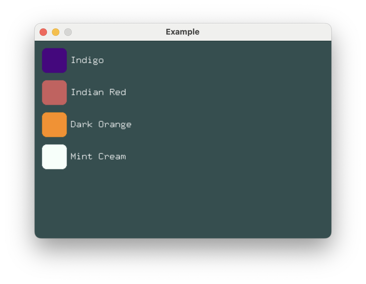
In the Stack Spacing section, VStack was used to create what looks
suspiciously like a list of identical rows. For this purpose, ForEach is typically a
better choice. Use ForEach when you want to display a collection of like views.
extern crate buoyant;
extern crate embedded_graphics;
extern crate embedded_graphics_simulator;
use embedded_graphics_simulator::{OutputSettings, SimulatorDisplay, Window};

const BACKGROUND_COLOR: Rgb888 = Rgb888::CSS_DARK_SLATE_GRAY;
const DEFAULT_COLOR: Rgb888 = Rgb888::WHITE;

fn main() {
    let mut window = Window::new("Example", &OutputSettings::default());
    let mut display: SimulatorDisplay<Rgb888> = SimulatorDisplay::new(Size::new(480, 320));

    display.clear(BACKGROUND_COLOR).unwrap();

    view(&SWATCHES)
        .as_drawable(display.size(), DEFAULT_COLOR, &mut ())
        .draw(&mut display)
        .unwrap();

    window.show_static(&display);
}

mod spacing {
    pub const ELEMENT: u32 = 6;
    pub const COMPONENT: u32 = 12;
}

struct Swatch {
    name: &'static str,
    color: Rgb888,
}

use buoyant::view::prelude::*;
use embedded_graphics::{mono_font::ascii::FONT_9X15, pixelcolor::Rgb888, prelude::*};

static SWATCHES: [Swatch; 4] = [
    Swatch {
        name: "Indigo",
        color: Rgb888::CSS_INDIGO,
    },
    Swatch {
        name: "Indian Red",
        color: Rgb888::CSS_INDIAN_RED,
    },
    Swatch {
        name: "Dark Orange",
        color: Rgb888::CSS_DARK_ORANGE,
    },
    Swatch {
        name: "Mint Cream",
        color: Rgb888::CSS_MINT_CREAM,
    },
];

fn view(swatches: &[Swatch]) -> impl View<Rgb888, ()> + use<'_> {
    ForEach::<10>::new_vertical(swatches, |swatch| {
        HStack::new((
            RoundedRectangle::new(8)
                .foreground_color(swatch.color)
                .frame_sized(40, 40),
            Text::new(swatch.name, &FONT_9X15).foreground_color(Rgb888::WHITE),
        ))
        .with_spacing(spacing::ELEMENT)
    })
    .with_alignment(HorizontalAlignment::Leading)
    .with_spacing(spacing::COMPONENT)
    .padding(Edges::All, spacing::COMPONENT)
}
ForEach requires you to provide a const size, and will lay out and render up to that
many items. As with VStack, the alignment and spacing of its subviews can be controlled.
#![allow(unused)]
fn main() {
extern crate buoyant;
use buoyant::view::prelude::*;
let radii = [1, 2, 3, 4, 5, 6, 7, 8, 9, 10];

ForEach::<10>::new_vertical(&radii, |radius| {
    RoundedRectangle::new(*radius)
});
}
The provided closure will be called for each item in the collection to produce a view.
While the rows in this example are simple and mostly identical, conditional views can be used to create the illusion of heterogeneity.
Performance Considerations and Future Work
Diff Animation
Buoyant does not currently support animating between orderings of a collection, and
will simply snap to the new ordering. This does not appear to be a difficult problem to
solve and the API of ForEach is expected to change in future versions to accommodate it.
It is likely to be through the introduction of an additional trait bound on the slice values.
Offscreen Elements
Laying out large collections can be expensive, especially when the collection is only
partially onscreen. Ideally, Buoyant would attempt to guess at the size of the offscreen
elements and reserve the N slots for items that are actually visible. Expect to see this
behavior eventually implemented, but there is a lot of core functionality that must be
built first.
Conditional Views
If you try something like this:
#![allow(unused)]
fn main() {
extern crate buoyant;
extern crate embedded_graphics;
use buoyant::view::prelude::*;
use embedded_graphics::{mono_font::ascii::FONT_9X15, pixelcolor::Rgb888};

fn view(is_redacted: bool) -> impl View<Rgb888, ()> {
    if is_redacted {
        Rectangle
    } else {
        Text::new("This is visible!", &FONT_9X15)
    }
}
}
You’ll of course get an error telling you that the types returned from each branch don’t match.
Buoyant provides two macros for creating content conditionally.
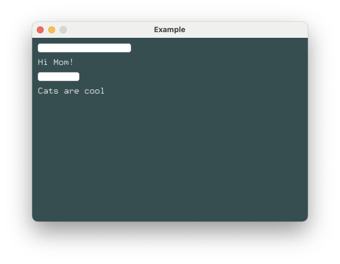
Conditional Views with if_view!
The if_view! macro allows you to write views as if you were writing a plain if statement.
extern crate buoyant;
extern crate embedded_graphics;
extern crate embedded_graphics_simulator;
use embedded_graphics_simulator::{OutputSettings, SimulatorDisplay, Window};

const BACKGROUND_COLOR: Rgb888 = Rgb888::CSS_DARK_SLATE_GRAY;
const DEFAULT_COLOR: Rgb888 = Rgb888::WHITE;

fn main() {
    let mut window = Window::new("Example", &OutputSettings::default());
    let mut display: SimulatorDisplay<Rgb888> = SimulatorDisplay::new(Size::new(480, 320));

    display.clear(BACKGROUND_COLOR).unwrap();

    view()
        .as_drawable(display.size(), DEFAULT_COLOR, &mut ())
        .draw(&mut display)
        .unwrap();

    window.show_static(&display);
}

use buoyant::if_view;
use buoyant::view::prelude::*;
use embedded_graphics::{mono_font::ascii::FONT_9X15, pixelcolor::Rgb888, prelude::*};

fn secret_message(message: &str, is_redacted: bool) -> impl View<Rgb888, ()> + use<'_> {
    if_view!((is_redacted) {
        RoundedRectangle::new(4)
            .frame()
            .with_width(9 * message.len() as u32) // yeah yeah ignoring UTF8
            .with_height(15)
    } else {
        Text::new(message, &FONT_9X15)
    })
}

fn view() -> impl View<Rgb888, ()> {
    VStack::new((
        secret_message("Top secret message", true),
        secret_message("Hi Mom!", false),
        secret_message("hunter12", true),
        secret_message("Cats are cool", false),
    ))
    .with_spacing(10)
    .with_alignment(buoyant::layout::HorizontalAlignment::Leading)
    .padding(Edges::All, 10)
}
Option as a View
For simple cases where a view should be present only if a value is Some, Option
implements View:
extern crate buoyant;
extern crate embedded_graphics;
extern crate embedded_graphics_simulator;
use embedded_graphics_simulator::{OutputSettings, SimulatorDisplay, Window};

const BACKGROUND_COLOR: Rgb888 = Rgb888::CSS_DARK_SLATE_GRAY;
const DEFAULT_COLOR: Rgb888 = Rgb888::WHITE;

fn main() {
    let mut window = Window::new("Example", &OutputSettings::default());
    let mut display: SimulatorDisplay<Rgb888> = SimulatorDisplay::new(Size::new(480, 320));

    display.clear(BACKGROUND_COLOR).unwrap();

    view(Some("Hello"))
        .as_drawable(display.size(), DEFAULT_COLOR, &mut ())
        .draw(&mut display)
        .unwrap();

    window.show_static(&display);
}

use buoyant::view::prelude::*;
use embedded_graphics::{mono_font::ascii::FONT_9X15, pixelcolor::Rgb888, prelude::*};

fn view(message: Option<&'static str>) -> impl View<Rgb888, ()> {
    message.map(|s| Text::new(s, &FONT_9X15))
}
Variable Binding with match_view!
The match_view! macro is a more powerful version of if_view! that allows you to bind
variables in the match arms.
extern crate buoyant;
extern crate embedded_graphics;
extern crate embedded_graphics_simulator;
use embedded_graphics_simulator::{OutputSettings, SimulatorDisplay, Window};

const BACKGROUND_COLOR: Rgb888 = Rgb888::CSS_DARK_SLATE_GRAY;
const DEFAULT_COLOR: Rgb888 = Rgb888::WHITE;

fn main() {
    let mut window = Window::new("Example", &OutputSettings::default());
    let mut display: SimulatorDisplay<Rgb888> = SimulatorDisplay::new(Size::new(480, 320));

    display.clear(BACKGROUND_COLOR).unwrap();

    view()
        .as_drawable(display.size(), DEFAULT_COLOR, &mut ())
        .draw(&mut display)
        .unwrap();

    window.show_static(&display);
}

use buoyant::match_view;
use buoyant::view::prelude::*;
use embedded_graphics::{pixelcolor::Rgb888, prelude::*};

#[derive(Debug, Clone, Copy)]
enum Shape {
    Rectangle,
    RoundedRect(u16),
    None,
}

fn shape(shape: Shape) -> impl View<Rgb888, ()> {
    match_view!(shape, {
        Shape::Rectangle => {
            Rectangle
        },
        Shape::RoundedRect(radius) => {
            RoundedRectangle::new(radius)
        },
        Shape::None => {
            EmptyView
        }
    })
}

fn view() -> impl View<Rgb888, ()> {
    VStack::new((
        shape(Shape::Rectangle)
            .foreground_color(Rgb888::CSS_PALE_GREEN),
        shape(Shape::RoundedRect(10))
            .foreground_color(Rgb888::CSS_MEDIUM_ORCHID),
        shape(Shape::None)
            .foreground_color(Rgb888::WHITE),
        shape(Shape::RoundedRect(30))
            .foreground_color(Rgb888::CSS_INDIAN_RED),
    ))
    .with_spacing(10)
    .padding(Edges::All, 10)
}
Maintaining Consistent Spacing with EmptyView
Notice how despite returning a view for the Shape::None variant above, the correct spacing
remains between its neighbors. EmptyView is useful when you must return a view, but
don’t want anything to be rendered and don’t want to disrupt stack spacing.
Not all modifiers will transfer this spacing behavior when applied to an
EmptyView.
When an if_view! does not specify an else, EmptyView is implied for the else branch.
#![allow(unused)]
fn main() {
extern crate buoyant;
extern crate embedded_graphics;
use embedded_graphics::pixelcolor::Rgb888;
use embedded_graphics::mono_font::ascii::FONT_9X15;
use buoyant::view::prelude::*;
use buoyant::if_view;

/// A rectangle if not hidden, otherwise implicit `EmptyView`
fn maybe_rectangle(hidden: bool) -> impl View<Rgb888, ()> {
    if_view!((!hidden) {
        Rectangle
    })
}
}
Mutation & State
Take a look at this simple view with buttons to increment and decrement a counter:
#![allow(unused)]
fn main() {
extern crate buoyant;
extern crate embedded_graphics;
use buoyant::view::prelude::*;
use embedded_graphics::pixelcolor::{Rgb888, RgbColor};
use embedded_graphics::mono_font::ascii::FONT_9X15;

fn counter_view(count: i32) -> impl View<Rgb888, i32> {
    VStack::new((
        Text::new_fmt::<24>(
            format_args!("count: {count}"),
            &FONT_9X15,
        ),
        Button::new(
            |count: &mut i32| { *count += 1; },
            |_| Text::new("Increment", &FONT_9X15),
        ),
        Button::new(
            |count: &mut i32| { *count -= 1; },
            |_| Text::new("Decrement", &FONT_9X15),
        ),
    ))
}
}
What’s going on?
countis moved intocounter_view, and then the buttons have closures which can somehow also mutatecount? Where’s the dark magic macro hiding?– definitely not me, a Rust beginner first seeing this pattern in Xilem
Don’t worry, no unholy sacrifices to the borrow checker have been made. The variable
name count is just being reused in two separate contexts:
-
View Instantiation: Data is passed in the function parameters to construct the view. This data is (generally) going to be immutable. Nothing special here, just passing data to functions.
-
Event Handling: The second generic parameter of
View<Color, XYZ>means event handlers in this view are promised an&mut XYZ. This type can of course be different from the view function parameters, and is not available when constructing the view.
The example could also be written in a way that’s hopefully more clear:
#![allow(unused)]
fn main() {
extern crate buoyant;
extern crate embedded_graphics;
use buoyant::view::prelude::*;
use embedded_graphics::pixelcolor::{Rgb888, RgbColor};
use embedded_graphics::mono_font::ascii::FONT_9X15;

fn counter_view(count_readonly: i32) -> impl View<Rgb888, i32> {
    VStack::new((
        Text::new_fmt::<24>(
            format_args!("count: {count_readonly}"),
            &FONT_9X15,
        ),
        Button::new(
            |count_mut: &mut i32| { *count_mut += 1; },
            |_| Text::new("Increment", &FONT_9X15),
        ),
        Button::new(
            |count_mut: &mut i32| { *count_mut -= 1; },
            |_| Text::new("Decrement", &FONT_9X15),
        ),
    ))
}
}
The read-only count is passed when the view is constructed, and the mutable
reference to count is passed when handling events.
Fonts
-
embedded-graphics monospace: Fixed-width fonts from the
embedded-graphicscrate, perfect for simple displays and consistent spacing. -
U8g2: A rich collection of fonts ported from the U8g2 library, offering more variety in styles and sizes.
-
RustType: Display common font formats (.otf, .ttf) through the
rusttypecrate for high-quality text rendering, support for variable sizing, and hinted antialiasing.
Supported Features
| Font | Precise Bounds | Variable Sizing | Hinted Antialiasing |
|---|---|---|---|
| EG Monospace | - | - | - |
| U8g2 | ✅ | - | - |
| rusttype | ✅ | ✅ | ✅ |
Precise Bounds
By default, Buoyant will lay out text such that adjacent Text views in HStacks and
VStacks are consistently spaced and aligned regardless of their content. This is achieved
by extending the view width by the last glyph’s advance, and the height by the line spacing.
However, you may want the view’s bounds to tightly fit the actual drawn pixels of the text, such as when adding backgrounds or borders to text. In this case, you can enable precise bounds:
#![allow(unused)]
fn main() {
extern crate buoyant;
extern crate u8g2_fonts;
use buoyant::view::prelude::*;
use u8g2_fonts::{fonts, FontRenderer};

static HELVETICA: FontRenderer = FontRenderer::new::<fonts::u8g2_font_helvR12_tr>();

Text::new("Buoyant", &HELVETICA)
    .with_precise_bounds()
;
}
Variable Sizing
Fonts which have no intrinsic size, such as TrueType fonts, can be rendered at variable
sizes using the .with_font_size(pts) modifier:
Text::new("hello", &TTF_FONT)
   .with_font_size(22)
If no size is specified, a default size (12pt) will be used.
Hinted Antialiasing
Buoyant supports hinted antialiased rendering which differs from standard antialiasing in that a background color must be provided to allow the render target to blend edges. The actual underlying pixels are not read.
The hint can be set several ways, including:
- Using the
.hint_background_color(color)modifier, to manually specify a background color on a view subtree, - Using the
.background_color(color, shape)modifier, which renders a shape with the specified fill color behind the view, automatically setting the hint, or - Providing a hint when initializing the render target, such as
EmbeddedGraphicsRenderTarget::new_hinted(&mut display, color);.
Setting a hint is not required, and text will render without antialiasing if no hint is provided.
Embedded Graphics Fonts
The embedded-graphics crate provides a selection of fixed-width fonts. These bitmapped
fonts are easy to use and render quickly, making them ideal for text in low-resource applications.
extern crate buoyant;
extern crate embedded_graphics;
extern crate embedded_graphics_simulator;
use embedded_graphics::{pixelcolor::Rgb888, prelude::*};
use embedded_graphics_simulator::{OutputSettings, SimulatorDisplay, Window};
const BACKGROUND_COLOR: Rgb888 = Rgb888::CSS_DARK_SLATE_GRAY;
const DEFAULT_COLOR: Rgb888 = Rgb888::WHITE;
fn main() {
let mut window = Window::new("Example", &OutputSettings::default());
let mut display: SimulatorDisplay<Rgb888> = SimulatorDisplay::new(Size::new(480, 320));
display.clear(BACKGROUND_COLOR).unwrap();
view()
.as_drawable(display.size(), DEFAULT_COLOR, &mut ())
.draw(&mut display)
.unwrap();
window.show_static(&display);
}
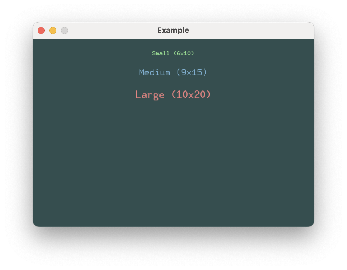
use buoyant::view::prelude::*;
use embedded_graphics::mono_font::ascii::{FONT_10X20, FONT_6X10, FONT_9X15};
fn view() -> impl View<Rgb888, ()> {
VStack::new((
Text::new("Small (6x10)", &FONT_6X10)
.foreground_color(Rgb888::CSS_PALE_GREEN),
Text::new("Medium (9x15)", &FONT_9X15)
.foreground_color(Rgb888::CSS_LIGHT_SKY_BLUE),
Text::new("Large (10x20)", &FONT_10X20)
.foreground_color(Rgb888::CSS_LIGHT_CORAL),
))
.with_spacing(20)
.with_alignment(HorizontalAlignment::Center)
.flex_infinite_width(HorizontalAlignment::Center)
.padding(Edges::All, 20)
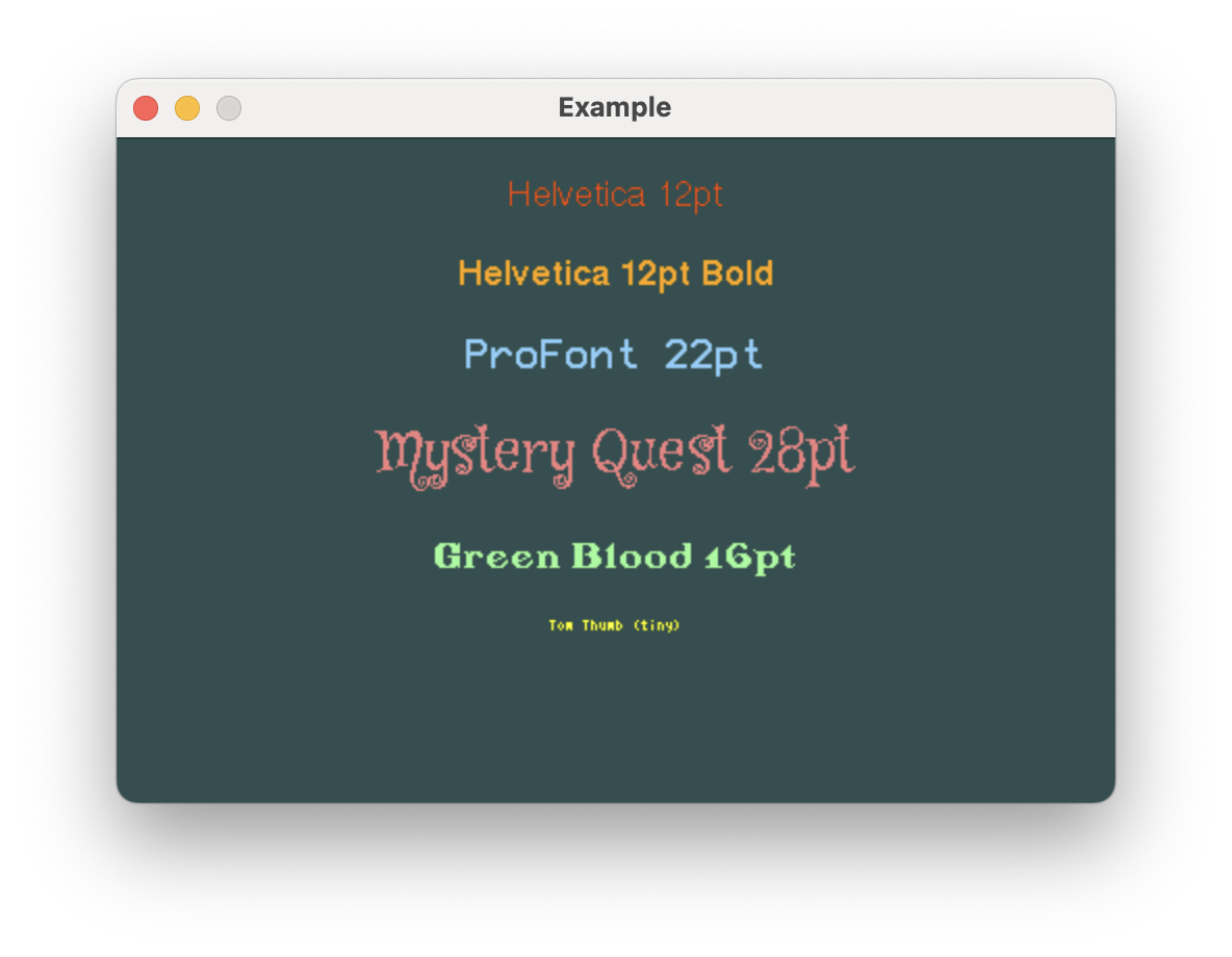
}U8g2 Fonts
For more font variety, u8g2-fonts provides many
different font styles and sizes optimized for embedded use.
The u8g2 wiki is the best catalog to search for specific u8g2 fonts.
extern crate buoyant;
extern crate embedded_graphics;
extern crate embedded_graphics_simulator;
extern crate u8g2_fonts;
use embedded_graphics::{pixelcolor::Rgb888, prelude::*};
use embedded_graphics_simulator::{OutputSettings, SimulatorDisplay, Window};
const BACKGROUND_COLOR: Rgb888 = Rgb888::CSS_DARK_SLATE_GRAY;
const DEFAULT_COLOR: Rgb888 = Rgb888::WHITE;
fn main() {
let mut window = Window::new("Example", &OutputSettings::default());
let mut display: SimulatorDisplay<Rgb888> = SimulatorDisplay::new(Size::new(480, 320));
display.clear(BACKGROUND_COLOR).unwrap();
view()
.as_drawable(display.size(), DEFAULT_COLOR, &mut ())
.draw(&mut display)
.unwrap();
window.show_static(&display);
}
use buoyant::view::prelude::*;
use u8g2_fonts::{fonts, FontRenderer};
static HELVETICA: FontRenderer = FontRenderer::new::<fonts::u8g2_font_helvR12_tr>();
static HELVETICA_BOLD: FontRenderer = FontRenderer::new::<fonts::u8g2_font_helvB12_tr>();
static PROFONT_22: FontRenderer = FontRenderer::new::<fonts::u8g2_font_profont22_mr>();
static MYSTERY_QUEST_28: FontRenderer = FontRenderer::new::<fonts::u8g2_font_mystery_quest_28_tr>();
static GREENBLOOD: FontRenderer = FontRenderer::new::<fonts::u8g2_font_greenbloodserif2_tr>();
static TOM_THUMB: FontRenderer = FontRenderer::new::<fonts::u8g2_font_tom_thumb_4x6_mr>();
fn view() -> impl View<Rgb888, ()> {
VStack::new((
Text::new("Helvetica 12pt", &HELVETICA)
.foreground_color(Rgb888::CSS_ORANGE_RED),
Text::new("Helvetica 12pt Bold", &HELVETICA_BOLD)
.foreground_color(Rgb888::CSS_ORANGE),
Text::new("ProFont 22pt", &PROFONT_22)
.foreground_color(Rgb888::CSS_LIGHT_SKY_BLUE),
Text::new("Mystery Quest 28pt", &MYSTERY_QUEST_28)
.foreground_color(Rgb888::CSS_LIGHT_CORAL),
Text::new("Green Blood 16pt", &GREENBLOOD)
.foreground_color(Rgb888::CSS_PALE_GREEN),
Text::new("Tom Thumb (tiny)", &TOM_THUMB)
.foreground_color(Rgb888::CSS_YELLOW),
))
.with_spacing(20)
.with_alignment(HorizontalAlignment::Center)
.flex_infinite_width(HorizontalAlignment::Center)
.padding(Edges::All, 20)
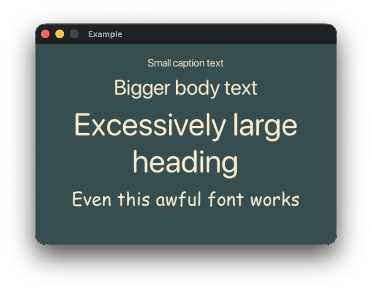
}RustType Fonts
OpenType fonts loaded with rusttype are rendered with the embedded_ttf crate,
providing high-quality text rendering with support for variable sizing and antialiasing.
// MDBook does not appear to support include_bytes!, so this example is marked ignore.
// If you find this example broken, please open an issue :)
extern crate buoyant;
extern crate embedded_graphics;
extern crate embedded_graphics_simulator;
extern crate rusttype;
use embedded_graphics::{pixelcolor::Rgb888, prelude::*};
use embedded_graphics_simulator::{OutputSettings, SimulatorDisplay, Window};

const BACKGROUND_COLOR: Rgb888 = Rgb888::CSS_DARK_SLATE_GRAY;
const DEFAULT_COLOR: Rgb888 = Rgb888::WHITE;

fn main() {
    let mut window = Window::new("Example", &OutputSettings::default());
    let mut display: SimulatorDisplay<Rgb888> = SimulatorDisplay::new(Size::new(480, 320));

    display.clear(BACKGROUND_COLOR).unwrap();

    view()
        .as_drawable(display.size(), DEFAULT_COLOR, &mut ())
        .draw(&mut display)
        .unwrap();

    window.show_static(&display);
}

use buoyant::view::prelude::*;
use std::sync::LazyLock;

static SF_ROUNDED: LazyLock<rusttype::Font<'static>> = LazyLock::new(|| {
    let bytes = include_bytes!("fonts/SF-Pro-Rounded-Regular.otf");
    rusttype::Font::try_from_bytes(bytes).unwrap()
});

static COMIC_SANS: LazyLock<rusttype::Font<'static>> = LazyLock::new(|| {
    let bytes = include_bytes!("fonts/Comic Sans MS.ttf");
    rusttype::Font::try_from_bytes(bytes).unwrap()
});

fn view() -> impl View<Rgb888, ()> {
    VStack::new((
        Text::new("Small caption text", &*SF_ROUNDED).with_font_size(20),
        Text::new("Bigger body text", &*SF_ROUNDED).with_font_size(40),
        Text::new("Excessively large heading", &*SF_ROUNDED)
            .with_font_size(60)
            .multiline_text_alignment(HorizontalTextAlignment::Center),
        Text::new("Even this awful font works", &*COMIC_SANS).with_font_size(40),
    ))
    .with_spacing(10)
    .with_alignment(HorizontalAlignment::Center)
    .foreground_color(Rgb888::CSS_BLANCHED_ALMOND)
    .flex_infinite_width(HorizontalAlignment::Center)
    .padding(Edges::All, 20)
    .hint_background_color(BACKGROUND_COLOR)
}
Loading RustType Fonts
rusttype::Font::try_from_bytes(bytes) is not a const fn, so fonts must be
initialized at runtime.
Depending on the features available and desired functionality, different static
initialization methods can be used. std::sync::LazyLock is a convenient choice for std
environments, while core::cell::OnceCell or core::cell::LazyCell may be preferable
for static font initialization in no_std contexts. Dynamic font loading is possible, but
left as an exercise for the reader.
Animation
View subtrees can be animated by attaching the .animated() modifier to a view. This modifier
creates smooth transitions between instances of the view.
pub fn animated<T>(self, animation: Animation, value: T) -> Animated<Self, T>
where
    T: PartialEq + Clone
Triggering Animation
When the value provided to the .animated() modifier changes, the animation render tree node
drives an animation factor using the provided curve that its children use to interpolate
their properties.
Any changes to the view’s properties that occur without changing the value passed to
.animated()will not animate.
Render Trees
Rather than directly render your views, Buoyant constructs a tree of render nodes that represent a snapshot of all the resolved positions, sizes, and colors of your views. This tree is what is actually rendered.

#![allow(unused)]
fn main() {
extern crate buoyant;
extern crate embedded_graphics;
use std::time::Duration;

use buoyant::{
    animation::Animation,
    layout::Alignment::{Leading, Trailing},
    view::prelude::*,
};
use embedded_graphics::{pixelcolor::Rgb888, prelude::RgbColor as _};

fn toggle(is_on: bool) -> impl View<Rgb888, ()> {
    ZStack::new((
        Capsule.foreground_color(Rgb888::BLACK),
        Circle
            .foreground_color(Rgb888::WHITE)
            .padding(Edges::All, 2)
            .animated(Animation::ease_out(Duration::from_millis(120)), is_on),
    ))
    .with_alignment(if is_on { Trailing } else { Leading })
    .frame_sized(50, 25)
}
}
In the animated toggle above, the alignment of the circle changes from Alignment::Leading
to Alignment::Trailing, moving it between the left and right sides of the capsule.
Rather than attempting to figure out what it means to animate between Leading and Trailing,
the absolute position and radius of the circle is animated from one tree to the next.
This is generally true, and when you specify an animation, you aren’t actually animating between the properties of the view but rather the properties of the resultant render tree. Because all render trees of the same view are the exact same type, interpolating between them is both cheap and easy.
Notice how some view nodes do not produce a render node. The render tree contains only the bare minimum information needed to render the view.
Memory Usage Considerations
Because each render tree contains a complete snapshot of your views, there are a couple ways you can accidentally end up using more memory than you expected. This may be obvious, but the render tree must hold a copy of any value that changes between views to satisfy the borrow checker.
Wherever possible, prefer using borrowed types like &str for static text where only the
reference will be cloned.
Be mindful of the size of values you pass to .animated(). The value will be cloned,
and a copy stored in each render tree. If you must track a large value, consider
using a hash instead of the value itself.
Compound Animation
When multiple simultaneous and overlapping animations occur, you may see unexpected results.
Imagine what would happen if the toggle from the render tree example had some parent animation node that was animating a change in the position of the entire toggle:

That animation factor leaks down to the capsule, allowing the capsule to animate between its old and new positions at a different rate than the circle causing the two to separate!
Although it may seem like the solution is to simply move the animation above the ZStack so that it contains both elements, this causes a new problem. The circle and capsule animate together, but the toggle component moves at a different rate than its animated siblings.
Geometry Group
The solution to this is the .geometry_group() modifier. This modifier creates a new
virtual coordinate space within which all children are rendered. Under the influence of
animation, the coordinate space offset is animated, resulting in all children moving
together relative to the geometry group frame.
#![allow(unused)]
fn main() {
extern crate buoyant;
extern crate embedded_graphics;
use std::time::Duration;

use buoyant::{
    animation::Animation,
    layout::Alignment::{Leading, Trailing},
    view::prelude::*,
};
use embedded_graphics::{pixelcolor::Rgb888, prelude::RgbColor as _};

fn toggle(is_on: bool) -> impl View<Rgb888, ()> {
    ZStack::new((
        Capsule.foreground_color(Rgb888::BLACK),
        Circle
            .foreground_color(Rgb888::WHITE)
            .padding(Edges::All, 2)
            .animated(Animation::ease_out(Duration::from_millis(120)), is_on),
    ))
    .with_alignment(if is_on { Trailing } else { Leading })
    .frame_sized(50, 25)
    .geometry_group() // <-----
}
}
Now, the capsule never sees its position change from (0, 0) and the circle only ever
sees its position move horizontally.
Geometry group does not block inherited animation factors from applying to its children.
Transitions
Transitions occur when you have a conditional view like if_view! or match_view! which
changes branches. Because the branches contain different subtrees, there is no
reasonable way to animate between them. In cases like this, the conditional
view uses a transition to animate between the two branches.

The properties of views within unchanged branches are still animated as normal.
Configuring Transitions
The Opacity transition is used by default, but it can be changed with the .transition()
modifier.
#![allow(unused)]
fn main() {
extern crate buoyant;
extern crate embedded_graphics;
use embedded_graphics::pixelcolor::Rgb888;
use std::time::Duration;
use buoyant::{
    if_view,
    view::prelude::*,
    transition::{Move, Slide},
};

fn maybe_round(is_square: bool) -> impl View<Rgb888, ()> {
    if_view!((is_square) {
        Rectangle
          .frame_sized(20, 20)
          .transition(Slide::leading())
    } else {
        Circle
          .frame_sized(20, 20)
          .transition(Move::top())
    })
    .animated(Animation::ease_out(Duration::from_millis(120)), is_square)
}
}
Transitions must have some parent animation node with a value that matches the condition
for the transition or they will not animate. The transition duration is determined by the
animation node driving it.
For transitions like Move and Slide, the size of the whole transitioning subtree is used
to determine how far to move the view. The transition modifier does not need to be the
outermost modifier, and where you place it has no bearing on the resulting effect.
These two views produce the exact same transition:
#![allow(unused)]
fn main() {
extern crate buoyant;
extern crate embedded_graphics;
use embedded_graphics::pixelcolor::Rgb888;
use std::time::Duration;
use buoyant::{
    if_view,
    view::prelude::*,
    transition::{Move, Slide},
};

fn all_the_same_1(is_square: bool) -> impl View<Rgb888, ()> {
    if_view!((is_square) {
        Rectangle
          .frame_sized(20, 20)
          .padding(Edges::All, 5)
          .transition(Slide::leading()) // Outermost modifier
    })
    .animated(Animation::ease_out(Duration::from_millis(120)), is_square)
}

fn all_the_same_2(is_square: bool) -> impl View<Rgb888, ()> {
    if_view!((is_square) {
        Rectangle
          .transition(Slide::leading()) // Innermost modifier
          .frame_sized(20, 20)
          .padding(Edges::All, 5)
    })
    .animated(Animation::ease_out(Duration::from_millis(120)), is_square)
}

}
Where To Apply Transitions
For views like VStack where there is no obvious way to choose between the
transitions requested by its children, the default Opacity will be used.
The transitions applied inside the stack here have no effect:
#![allow(unused)]
fn main() {
extern crate buoyant;
extern crate embedded_graphics;
use embedded_graphics::pixelcolor::Rgb888;
use std::time::Duration;
use buoyant::{
    if_view,
    view::prelude::*,
    transition::{Move, Slide},
};

fn lost_in_the_stacks(thing: bool) -> impl View<Rgb888, ()> {
    if_view!((thing) {
        VStack::new((
            Rectangle.transition(Slide::trailing()),
            Rectangle.transition(Move::leading())
      )) // .transition(...) <-- Here would work!
    })
    .animated(Animation::ease_out(Duration::from_millis(120)), thing)
}
}
To get the stack in this example to transition, apply the transition outside the stack.
Prefer Computed Properties
Unless transitioning is the desired behavior, prefer using computed properties over conditional views when the conditional view’s branches are the same type.
#![allow(unused)]
fn main() {
extern crate buoyant;
extern crate embedded_graphics;
use buoyant::{
    if_view,
    view::prelude::*,
};
use embedded_graphics::pixelcolor::Rgb888;

/// This will jump between two different rectangles
fn bar1(is_wide: bool) -> impl View<Rgb888, ()> {
    if_view!((is_wide) {
        Rectangle.frame_sized(100, 5)
    } else {
        Rectangle.frame_sized(20, 5)
    })
}

/// This will animate the frame of the Rectangle
fn bar2(is_wide: bool) -> impl View<Rgb888, ()> {
    Rectangle.frame_sized(if is_wide { 100 } else { 20 }, 5)
}
}
Event Loops
Buoyant provides the App type as a convenience to manage the view and render tree lifecycle,
focus state, and event handling.
Using the provided App type is not required, and you can manage the view lifecycle
and event handling yourself if you have more complex needs.
App
App is initialized with an initial state, display size, and a view function. The view
function takes a reference to your state and returns a view:
#![allow(unused)]
fn main() {
extern crate buoyant;
extern crate embedded_graphics;
use buoyant::app::App;
use buoyant::view::prelude::*;
use buoyant::primitives::Size;
use embedded_graphics::pixelcolor::Rgb888;

#[derive(Clone, Default)]
struct State {
    count: i32,
}

fn counter_view(state: &State) -> impl View<Rgb888, State> + use<> {
    let count = state.count;
    Button::new(
        |state: &mut State| state.count += 1,
        move |_| EmptyView,
    )
}


let mut app = App::new(State::default(), Size::new(200, 100), counter_view);

}
fn counter_view(state: &State) -> impl View<Rgb888, State> + use<> {
let count = state.count;
Button::new(
|state: &mut State| state.count += 1,
move |_| {
Text::new_fmt::<48>(
format_args!("I've been tapped {count} times!"),
&embedded_graphics::mono_font::ascii::FONT_10X20,
)
.foreground_color(Rgb888::WHITE)
.padding(Edges::All, 10)
},
)
}Handling Events
The Harness trait, implemented by App, provides Harness::send(), which can be used
to send events to the app. In addition to send(), a number of convenience methods are
provided for constructing common events.
Here, events generated by the embedded-graphics-simulator window are mapped into Buoyant
events using a MouseTracker, then sent to the app with App::send():
loop {
// Update the app time
app.set_time(app_start.elapsed());
// Process simulator events
window
.events()
.filter_map(|event| {
// The simulator won't exit if we don't handle this
if event == embedded_graphics_simulator::SimulatorEvent::Quit {
exit(0);
}
mouse_tracker.process_event(event)
})
.for_each(|event| {
app.send(event);
});
// rendering...
}Rendering
To determine whether rendering a new frame is necessary, two fields should be checked:
-
App::should_redraw(): This flag is set when the state changes or a view modifies the render tree during event handling, such as on aScrollViewdrag. -
RenderTarget::clear_animation_status(): Render tree nodes, such as animations, set a flag on the render target when they’re drawn and animation is in progress. This flag is initially set totrue.
loop {
// event handling...
// Only render if active animation was reported or redraw is needed
if app.should_redraw() || target.clear_animation_status() {
// Render animated transition between source and target trees
app.render_animated(&mut target, &Rgb888::WHITE);
// Send to the display
window.update(target.display());
// Clear for the next frame
target.clear(Rgb888::BLACK);
} else {
// Optionally cap polling rate by sleeping
std::thread::sleep(Duration::from_millis(5));
}
}Mutating State Outside the View
Generally, state changed as a direct result of user input (e.g. button taps) will
cause the view to be rebuilt automatically. To access the state outside the view,
you can use App::state_mut() which returns a (wrapped) mutable reference to the app state.
Mutably dereferencing this object will automatically trigger a view rebuild with the
updated state. This is a handy convenience to prevent missing an update, but be aware
of the potential to accidentally trigger rebuilds when no state actually changed.
#![allow(unused)]
fn main() {
extern crate buoyant;
extern crate embedded_graphics;
use buoyant::app::App;
use buoyant::view::prelude::*;
use buoyant::primitives::Size;
use embedded_graphics::pixelcolor::Rgb888;
#[derive(Clone, Default)]
struct State { count: i32 }
fn counter_view(state: &State) -> impl View<Rgb888, State> + use<> {
Button::new(
|state: &mut State| state.count += 1,
move |_| EmptyView,
)
}
let mut app = App::new(State::default(), Size::new(200, 100), counter_view);
// The state can be read and a mutable reference obtained
// without triggering a rebuild:
let count = app.state().count;
let mut s = app.state_mut();
// Mutably dereferencing triggers a view rebuild:
s.count = 42;
}Render trees are rebuilt lazily upon calling App::render_animated() or App::finalize_view()
if the state may have changed.
App::force_rebuild()can be used to force the view to rebuild if the state has changed without Buoyant’s knowledge, like through interior mutability.
Complete Example
extern crate buoyant;
extern crate embedded_graphics;
extern crate embedded_graphics_simulator;
use std::process::exit;
use std::time::{Duration, Instant};
use buoyant::{
app::{App, Harness},
event::simulator::MouseTracker,
render_target::{EmbeddedGraphicsRenderTarget, RenderTarget as _},
view::prelude::*,
};
use embedded_graphics::{pixelcolor::Rgb888, prelude::*};
use embedded_graphics_simulator::{OutputSettings, SimulatorDisplay, Window};
#[derive(Clone, Default)]
struct State {
count: i32,
}
fn main() {
let size = Size::new(200, 100);
let mut display: SimulatorDisplay<Rgb888> = SimulatorDisplay::new(size.into());
let mut target = EmbeddedGraphicsRenderTarget::new(&mut display);
let mut window = Window::new("Example", &OutputSettings::default());
// Send at least one update to the window so it doesn't panic when fetching events
window.update(target.display());
let app_start = Instant::now();
// This derives higher-level mouse events from the raw simulator events
let mut mouse_tracker = MouseTracker::new();
// Create app with view lifecycle management
let mut app = App::new(State::default(), size.into(), counter_view);
// Main event loop
loop {
// Update the app time
app.set_time(app_start.elapsed());
// Process simulator events
window
.events()
.filter_map(|event| {
// The simulator won't exit if we don't handle this
if event == embedded_graphics_simulator::SimulatorEvent::Quit {
exit(0);
}
mouse_tracker.process_event(event)
})
.for_each(|event| {
app.send(event);
});
// Only render if active animation was reported or redraw is needed
if app.should_redraw() || target.clear_animation_status() {
// Render animated transition between source and target trees
app.render_animated(&mut target, &Rgb888::WHITE);
// Send to the display
window.update(target.display());
// Clear for the next frame
target.clear(Rgb888::BLACK);
} else {
// Optionally cap polling rate by sleeping
std::thread::sleep(Duration::from_millis(5));
}
}
}
fn counter_view(state: &State) -> impl View<Rgb888, State> + use<> {
    let count = state.count;
    Button::new(
        |state: &mut State| state.count += 1,
        move |_| {
            Text::new_fmt::<48>(
                format_args!("I've been tapped {count} times!"),
                &embedded_graphics::mono_font::ascii::FONT_10X20,
            )
            .foreground_color(Rgb888::WHITE)
            .padding(Edges::All, 10)
        },
    )
}Manual View Lifecycle
Taking the simple Hello World example, the AsDrawable trait usage can be replaced
with a manual view lifecycle.
extern crate buoyant;
extern crate embedded_graphics;
extern crate embedded_graphics_simulator;
use buoyant::{
    environment::DefaultEnvironment,
    render::Render as _,
    render_target::EmbeddedGraphicsRenderTarget,
    view::prelude::*,
};
use embedded_graphics::{mono_font::ascii::FONT_10X20, pixelcolor::Rgb888, prelude::*};
use embedded_graphics_simulator::{OutputSettings, SimulatorDisplay, Window};

const BACKGROUND_COLOR: Rgb888 = Rgb888::BLACK;
const DEFAULT_COLOR: Rgb888 = Rgb888::WHITE;

fn main() {
    let size = Size::new(480, 320);
    let mut window = Window::new("Hello World", &OutputSettings::default());
    let mut display: SimulatorDisplay<Rgb888> = SimulatorDisplay::new(size);
    let mut target = EmbeddedGraphicsRenderTarget::new(&mut display);

    target.display_mut().clear(BACKGROUND_COLOR).unwrap();

    let environment = DefaultEnvironment::default();
    let origin = buoyant::primitives::Point::zero();

    let mut app_data = ();

    let view = hello_view();

    let mut app_state = view.build_state(&mut app_data);
    let layout = view.layout(&size.into(), &environment, &mut app_data, &mut app_state);
    let render_tree = view.render_tree(&layout.sublayouts, origin, &environment, &mut app_data, &mut app_state);

    render_tree.render(&mut target, &DEFAULT_COLOR);

    window.show_static(target.display());
}

fn hello_view() -> impl View<Rgb888, ()> {
    HStack::new((
        Text::new("Hello", &FONT_10X20).foreground_color(Rgb888::GREEN),
        Spacer::default(),
        Text::new("World", &FONT_10X20).foreground_color(Rgb888::YELLOW),
    ))
    .padding(Edges::All, 20)
}
Layout
let layout = view.layout(&size.into(), &environment, &mut app_data, &mut app_state);The layout call resolves the sizes of all the views. It is a bug to try to reuse the layout after mutating the view, and Buoyant may panic if you do so.
Render Tree
let render_tree = view.render_tree(&layout, origin, &environment, &mut app_data, &mut app_state);The render tree is a minimal snapshot of the view. It holds a copy of the resolved positions,
sizes, colors, etc. of all the elements that are actually rendered to the screen.
Relational elements like Padding, Frames, alignment, and so on have been stripped.
Rendering
render_tree.render(&mut display, &DEFAULT_COLOR, origin);Here, the snapshot is finally rendered to the display buffer. A default color is passed in
which is used for elements that aren’t explicitly colored using .foreground_color().
Manually Animated Render Loops
Animating Between Render Trees
To animate rendering between two render trees, use the render_animated() method:
#![allow(unused)]
fn main() {
extern crate buoyant;
extern crate embedded_graphics;
use std::time::Duration;

use buoyant::{
    environment::DefaultEnvironment,
    primitives::{Point, Size},
    render::{
        AnimatedJoin, AnimationDomain, Render,
    },
    render_target::EmbeddedGraphicsRenderTarget,
    view::prelude::*,
};
use embedded_graphics::{pixelcolor::Rgb888, prelude::RgbColor};

let mut display = embedded_graphics::mock_display::MockDisplay::new();
let mut target = EmbeddedGraphicsRenderTarget::new(&mut display);
let app_time = Duration::from_secs(0);

let mut captures = ();
let environment = DefaultEnvironment::new(app_time);
let source_view = view();
let mut view_state = source_view.build_state(&mut ());
let source_layout = source_view.layout(&Size::new(200, 100).into(), &environment, &mut captures, &mut view_state);
let source_render_tree = source_view.render_tree(&source_layout.sublayouts, Point::zero(), &environment, &mut captures, &mut view_state);

let environment = DefaultEnvironment::new(app_time);
let target_view = view();
let target_layout = target_view.layout(&Size::new(200, 100).into(), &environment, &mut captures, &mut view_state);
let target_render_tree = target_view.render_tree(&target_layout.sublayouts, Point::zero(), &environment, &mut captures, &mut view_state);

Render::render_animated(
    &mut target,
    &source_render_tree,
    &target_render_tree,
    &Rgb888::BLACK,
    &AnimationDomain::top_level(app_time),
);

/// This is just a tribute to the greatest view in the world.
fn view() -> impl View<Rgb888, ()> {
    EmptyView // Couldn't remember
}
}
Joining Trees
Generally, all animations in Buoyant are interruptible. In the same way you can animate rendering between two trees, two trees can be joined at a moment in time to form a new one. This allows continuously merging and generating new trees to drive smooth compound animations.
Render tree types conform to AnimatedJoin, which allows you to create a joined tree
at a specific point in time. With some exceptions, the result of rendering the joined tree
is the same as rendering the two trees with render_animated().
#![allow(unused)]
fn main() {
extern crate buoyant;
extern crate embedded_graphics;
use std::time::Duration;

use buoyant::{
    environment::DefaultEnvironment,
    primitives::{Point, Size},
    render::{
        AnimatedJoin, AnimationDomain, Render,
    },
    render_target::EmbeddedGraphicsRenderTarget,
    view::prelude::*,
};
use embedded_graphics::{pixelcolor::Rgb888, prelude::RgbColor};

let mut display = embedded_graphics::mock_display::MockDisplay::new();
let mut target = EmbeddedGraphicsRenderTarget::new(&mut display);
let app_time = Duration::from_secs(0);

let mut captures = ();
let environment = DefaultEnvironment::new(app_time);
let source_view = view();
let mut view_state = source_view.build_state(&mut ());
let source_layout = source_view.layout(&Size::new(200, 100).into(), &environment, &mut captures, &mut view_state);
let source_render_tree = source_view.render_tree(&source_layout.sublayouts, Point::zero(), &environment, &mut captures, &mut view_state);

let environment = DefaultEnvironment::new(app_time);
let target_view = view();
let target_layout = target_view.layout(&Size::new(200, 100).into(), &environment, &mut captures, &mut view_state);
let mut target_render_tree = target_view.render_tree(&target_layout.sublayouts, Point::zero(), &environment, &mut captures, &mut view_state);

// Join two trees into the target
target_render_tree.join_from(
    &source_render_tree,
    &AnimationDomain::top_level(app_time),
);

// Calling render on the joined tree produces the same result as
// the render_animated call above
target_render_tree.render(&mut target, &Rgb888::BLACK);

fn view() -> impl View<Rgb888, ()> {
    EmptyView
}
}
Joining trees encodes information about the partially completed animation, which allows multiple staggered animations to occur in a render loop.
Building Custom Views
This documentation is in progress ~
Event Handling
KeyDown and KeyUp
Key events should be routed to the currently focused element. Containers proxy the event to
the currently focused child only and return Deferred if no child is focused. Containers
should generally not mutate the focus tree or search for a handler.
Touch
Touch events should be routed with depth first search. Non-matching elements should
return Deferred. Elements can signal to the focus_touches() modifier that they
should acquire focus by returning EventResult::handled_focused(). Elements like Button
should return EventResult::handled_unfocused() on touch down to indicate the touch
was handled but focus should not be moved.
Focus(_)
Obtain the current element, or the next one in the specified direction if the current element is non-matching.
Leaf views matching the requested role should return EventResult::handled_focused(),
otherwise Deferred.
Containers should search, starting with the currently focused child, until a child doesn’t
return Deferred. If the container’s children are exhausted, it should also return Deferred.
Next and Previous
Obtain the next or previous matching element.
Leaf views should always return Deferred. A leaf only receives Next if it is the
currently focused element.
Containers should search, starting with the currently focused child, until a child doesn’t
return Deferred. If the container’s children are exhausted, it should also return Deferred.
Containers receiving Next and Previous first pass the event to the currently focused child.
If the child returns Deferred, the container initializes the default focus of the next
child. The event is exchanged for the corresponding Focus(Forward/Backward) so that the
newly-initialized child can attempt to accept focus. Without this exchange, the first
element in the new child subtree would never be able to accept focus.
Select
Perform a primary action.
Leaf views matching the requested role should return EventResult::handled_focused(),
otherwise Deferred.
Containers should proxy the event to the currently focused child, but should not mutate the focus tree nor attempt to locate a previously unfocused child which handles the event.
Blur
Most elements should simply pass the event to the currently focused child and return the result.
Elements which can capture focus should first pass the event to their currently focused
child. If the child responds with Deferred, the captive element should release focus and
return EventResult::handled_focused(). If the child indicates the event was handled,
captive focus should not be released and the child result returned.
Teardown
Secondary state that tracked an element as being focused should be reset. A stale focus tree is about to be dropped, e.g. as a result of a touch causing focus to jump.
Teardown should not normally need to be called. It should be assumed that a Focus(_) event
will follow, reasserting focus, if the element is still focused in the new tree. I think
this (and its associated weirdness) can be removed by adding an Option<&mut Self::FocusTree>
arg to layout and render_tree. This would alleviate the pesky need to track any extra
non-source-of-truth state.
Containers must not wrap navigation on Teardown: they proxy the event to the currently
focused child and return the result without looping.